How the Colour of Online Casino Interfaces Influences Player Decisions: UI Psychology
The visual appearance of an online casino is far more than just a design preference. In a highly competitive gambling environment, the user interface (UI) can have a significant psychological impact on players’ behaviour. Colours, in particular, act as subconscious cues, guiding decisions, emotions, and even wagering habits. In this article, we delve into the psychological mechanisms behind colour use in online casinos and how design choices can subtly shape user experience and outcomes.
The Psychology of Colour in Online Gambling Interfaces
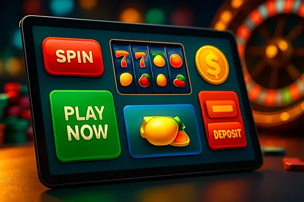
Colours evoke specific psychological responses, many of which are deeply rooted in human behaviour. In the context of online casinos, colour palettes are carefully selected to influence mood and perception. For example, red can trigger excitement and urgency, making players more inclined to make quicker decisions. On the other hand, blue conveys trust and calmness, often used in verification or banking sections to create a sense of security.
Green, associated with success and balance, is commonly used to highlight bonuses, wins, or call-to-action buttons like “Play Now.” It provides positive reinforcement while keeping the user in a psychologically “safe” zone. Black and gold are also popular, symbolising luxury and exclusivity, often used in VIP sections to suggest prestige and elite status.
The choice of colours is rarely accidental. Designers leverage studies in behavioural psychology and marketing to align visual elements with the casino’s strategic goals, whether that’s increasing engagement, prolonging session time, or boosting deposit rates.
Emotional Triggers and Colour Schemes
Emotions play a central role in decision-making, and colours have the power to evoke emotions almost instantly. Warm tones like red, orange, and yellow are often used in promotional banners to generate excitement or alert players about limited-time offers. These colours demand attention and trigger a sense of urgency that can lead to impulsive behaviour.
Cool colours like blue and purple are more likely to encourage rational thinking and prolonged engagement. When players are navigating help centres or browsing terms and conditions, these cooler tones can reduce stress and prevent early exits from the page. As a result, they are preferred in customer support areas or settings tabs.
Neutral colours such as grey and white offer clarity and contrast, particularly important in text-heavy sections or during the onboarding process. Proper colour balance ensures readability and reduces cognitive fatigue, making users more comfortable and focused during extended sessions.
User Engagement and Interface Aesthetics
The design of a user interface can either facilitate or hinder player interaction. An appealing colour scheme can significantly boost time-on-site, conversion rates, and user satisfaction. Research conducted in 2024 revealed that online casinos with visually consistent and psychologically balanced colour schemes had 22% higher user retention than those without intentional design frameworks.
Gamification elements, often represented through vibrant and interactive visuals, also rely heavily on colour psychology. Bright, animated buttons that change colour upon interaction add a dynamic layer to gameplay. This sensory feedback mechanism provides continuous stimulation, encouraging the user to stay engaged and explore more features.
Visual coherence also reduces bounce rates. When colours are used consistently across different parts of the interface, it helps build an intuitive navigation system. This enables players to subconsciously form a mental map of the site, improving usability and reducing decision fatigue.
Mobile Interfaces and Responsive Colour Design
With over 70% of users accessing online casinos via smartphones or tablets as of early 2025, mobile-friendly colour schemes have become essential. Smaller screens require optimised contrast ratios and clarity to ensure elements remain distinguishable and accessible without overwhelming the viewer.
Dark mode is now standard in many apps, including gambling platforms. It reduces eye strain and battery consumption, especially during night-time sessions. Effective use of vibrant colours against dark backgrounds can make key features pop without creating visual noise.
Touch-friendly colour-coded buttons improve accuracy and prevent misclicks. For example, red buttons are commonly reserved for irreversible actions like “Log Out” or “Cancel Bet,” whereas green or blue are used for confirming bets or transactions. These visual conventions enhance user trust and satisfaction.
Regulatory Compliance and Ethical Design
Regulators have become increasingly aware of the psychological techniques used in online gambling interfaces. In 2024, the UK Gambling Commission and similar European bodies introduced new guidelines focusing on ethical UI design, including restrictions on colour use in autoplay features and bonus promotions.
Using high-stimulation colours to manipulate user behaviour, particularly in vulnerable groups, is now under scrutiny. Ethical design principles encourage platforms to avoid aggressive visual stimuli in features like loss-chasing animations or flashy jackpots that could encourage compulsive gambling.
Instead, responsible gambling tools are being integrated into the UI with calming colours and clear messaging. Features like deposit limits, time-outs, and reality checks now appear in muted blues or greys to encourage user reflection rather than immediate action. These updates aim to balance business goals with social responsibility.
The Role of Transparency in Colour Application
Transparency in design isn’t just about data or terms—visual honesty is equally critical. Misleading players with colour illusions (e.g. showing a “win” in red or inflating minor rewards with golden glows) is considered deceptive and increasingly penalised by watchdogs.
Well-regarded online casinos are moving towards more neutral and honest colour indicators. Wins, losses, and bonuses are presented with subtle yet distinct colour cues, promoting clarity and informed decision-making. This helps foster trust and long-term user loyalty.
As users become savvier and more critical of visual manipulation, casinos that adopt transparent and ethical colour strategies are likely to outperform competitors not only in user trust but also in long-term revenue.
Similar articles
-
 How Casino Humour Reflects Socie...
Humour has long been used as a way to discuss topics that people …
-
 Myths About “Hot” and “Cold” Slo...
Slot machines have always generated discussions among casino players. Some gamblers are convinced …
-
 What to Do If an Online Casino D...
Account verification is a standard security step in online casinos, but delays can …
-
 How to Check Withdrawal Rules Be...
Understanding withdrawal conditions before creating an account is one of the most overlooked …